Mathematical Transformation
For this project, we learned a lot about linear and non linear functions. To start off we learned about basic linear functions and how to tell if its linear or not. Then we learned how they are created by using functions and tables. Once we understood all of this each student thought of their own way to represent a linear and non linear function. People chose things such as population of the earth and the amount of Iphones purchased each year. Everyone is creating visual pieces to represent their relation ships that we can present during exhibition.I chose to research the amount of Cars made each year and the amount of hybrids purchased each year. The amount of cars was the linear function and the amount of hybrids purchased each year was the non-linear funtion.I chose these two things to investigate because I like cars and It would be an interesting thing to learn. Once I figured out what I was going to investigate I did some online research to get some important data. I went online and found out data that showed the amount of cars built each year and made a table. I did the same for the other function and then graphed them using open office. By doing this, I was able to see if they were linear or not. I also had to find the line of best fit so I got a straight edge and drew a line that represented the line of best fit.
Basically to obtain my data I did some basic research about car sales on the internet. While researching I thought it would be interesting to research about hybrids and the amount sold. I picked three particular years to do my research on which were 2004, 2005, and 2006. I went on some websites which gave me accurate information about my research. The basically I made two charts on google docs with the non-linear problem and the linear problem. With this information I made two graphs in open office to show the pattern.
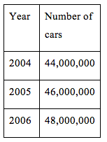
|
|
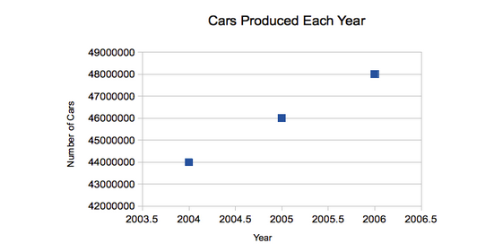
This graph above represents the amount of cars produced around the world each year. By looking at the graph we can see that the line is approximately linear. The amount of cars produced each year between 2004-2006 increases by approximately two million. Since this is a constant rate of growth, when we plot the points, its linear.
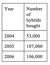
|
|
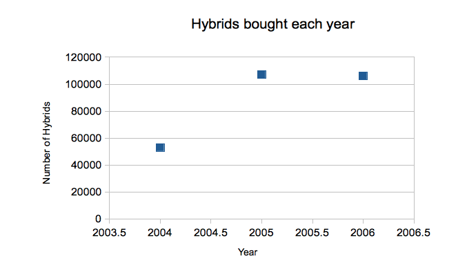
Looking at this graph we can see that the line is not linear because of the sudden drop in numbers. The line would have to be straight to be linear but because of the data in the graph it makes it non-linear when graphed From 2004-2005 the increase if very high causing a sharp incline but from 2005-2006 it decreases it messing up the line causing it to be non-linear
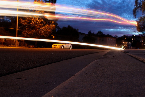
For my creative piece I wanted to do something related to my research which was cars. Using my passion of photography I decided to take a picture to represent my research. I did a photo called long exposure which captures light and movement and took a picture of cars passing by.
This project went fairly well for me and I had many successes and challenges. I liked the way that my table and graphs turned out because they were neat and very easy to understand. By looking at the graphs, it was really easy to see which was linear and which was not. I liked the way my final piece turned out because a lot of people like it and thought it was very unique and creative. One challenge that I had to overcome was choosing something to research about that wouldn't be too difficult. Once I found this I was pleased because I could find information quite easily for my data. I think I stayed very organized during the process and had all of my data in an online document so when it came time to do my graphs and tables it was easy to find. I found that using open office to make my graph made it much easier because it was accurate and very neatly done. I could have been a bit more patient during the process because I was getting frustrated in the beginning and wasted a lot of time causing me to rush. If I didn't rush as much I would have explained my data better and easier to understand.
